
For Real Capital London, a British family office with a growing global footprint, our brand identity goes far beyond standard corporate branding. The firm is represented by a striking eagle with “W”-shaped wings, rendered in classic British Green, a symbol heavily layered with meaning. As Real Capital London moves forward with a refreshed identity, our new logo has been created to capture the values that define us and the vision that guides our work. It is more than a symbol; it is a statement of who we are and what we stand for.
The eagle, with its distinctive wing formation, reflects balance, discipline, and clarity. Its ability to rise above while maintaining sharp focus mirrors our approach to investment – seeing the wider landscape while remaining attentive to detail. The wings, shaped into a subtle “W,” speak to the strength of structure and the prudence that underpin our decisions.
The “W” translates directly to their core investment philosophy: Strict risk management and unwavering prudence. It represents the solid bedrock necessary for building robust, multi-generational asset portfolios.
The sharp vision from the eagle represents a commitment to hyper-selectivity, filtering out market distractions to actively capture only those opportunities that offer exceptional long-term value.
British Green: Integrity, Prosperity, and Socially Responsible Growth
Our classic British Green emblem draws from traditional heraldry to signify deep loyalty, hope, and organic growth. Corporately, it represents compounding prosperity and our pledge of absolute integrity to all stakeholders.
The choice of British Green is equally deliberate. Rooted in heritage, it conveys integrity and loyalty, while also symbolising growth that is sustainable and socially responsible. It connects us to tangible assets such as healthcare, education, infrastructure, and real estate, and to the communities where our investments make a difference. Much like the enduring strength of nature, this colour reflects our commitment to prosperity that lasts.
High Altitude, Grounded Values
The “W”-winged green eagle serves as a masterful synthesis of two vital investment traits: sharp authority and grounded discipline. It tells the story of an institution that is deeply proud of its British heritage yet driven by a global vision.
For Real Capital London, the emblem is a clear reflection of our mission: to soar high enough to command a macro view of global markets, while keeping their feet firmly planted in sustainable values, safeguarding prosperity for gen#honganhfoundation
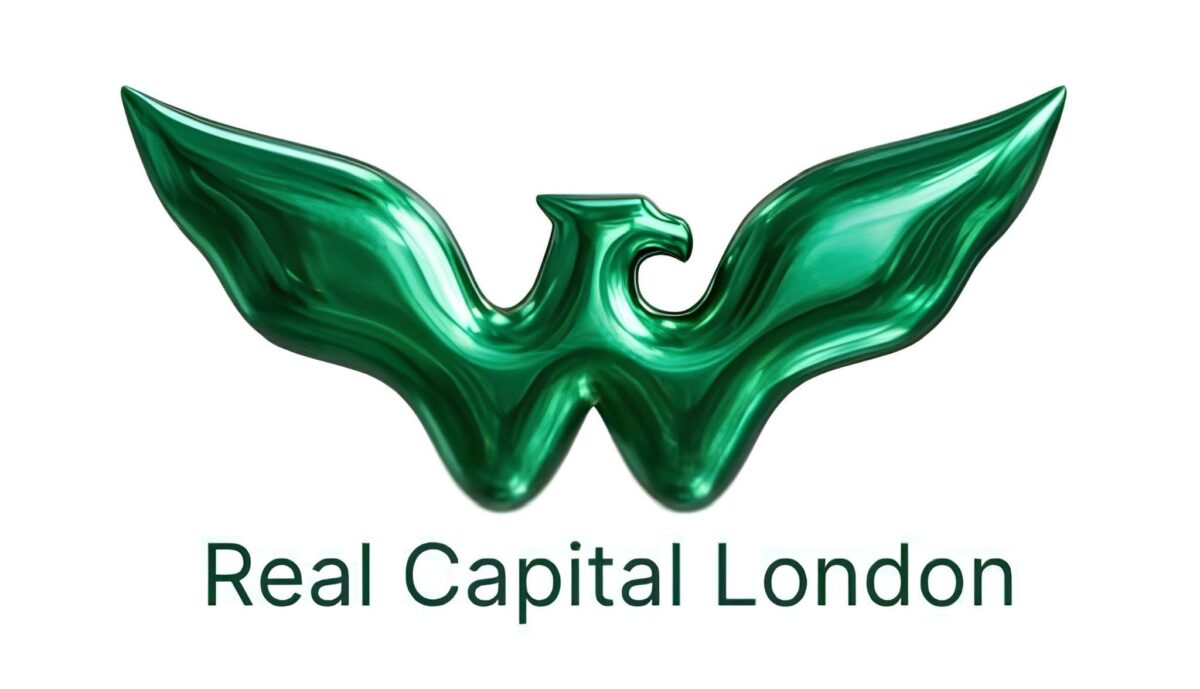
Real Capital London new logo